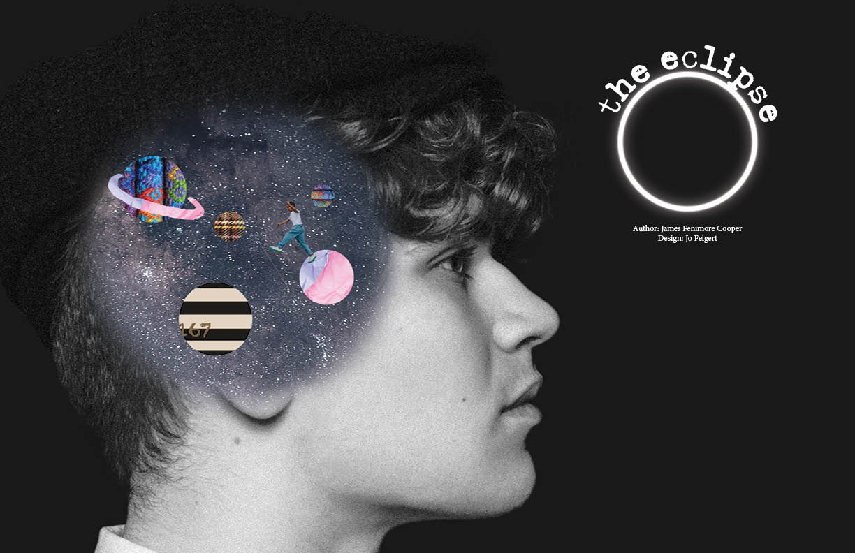
For this project, I created a full magazine layout based on the short story The Eclipse by James Fenimore Cooper. After reading and analyzing the narrative, I developed a cohesive visual design that flows consistently from the opening spread through each of the inner pages. My goal was to reflect the tone and themes of the story in the layout, typography, and imagery, crafting a publication that feels unified, engaging, and true to the text.I began this process by creating a mind map of ideas that the story sparked. This included everything from the imagery I envisioned while reading to the typography that I felt matched the tone of the narrative. Through this brainstorming stage, I was able to identify themes, emotional elements and visual motifs that would eventually guide my layout decisions. The mind map helped narrow my direction and gave me a foundation to begin thumbnail sketches, which allowed me to experiment with possible compositions before moving into digital layout. After finalizing a direction, I moved into Adobe InDesign where I worked with column grids, baseline grids and typographic hierarchy to bring the story to life in a structured and professional format. I refined spacing, margins and layout rhythm to maintain readability while still supporting the historical tone of the story. I also chose imagery that complemented the narrative instead of distracting from it, placing visuals strategically to enhance rather than dominate the text.Throughout the project, I shared drafts with classmates and participated in critique sessions, making adjustments based on feedback. These revisions helped improve visual balance, page flow and consistency across spreads. The images below depict my final design after several rounds of critique, revision and refinement.